20101230

Happy New Year! - card


This is my card for this part of the year. (Did I mention that I love playing with typefaces?)

20101222

Christmas card 2010


Think about the birds in the snowy weather!

20101218

Christmas decoration

As an educaded decorator, I worked happily as a volunteer on the the decoration of the feast arranged by the Hungaian Society in Aalborg. The low budget was a kind of challenge: I might not used more than 250 DKK for the decoration of the whole hall. With the help of some mates I collected a lot of pine tree branches, branches with different berries, pine cones, hortensia flowers, etc. in the nature. Then I made two different types of compositions (2 x 6 pieces) for the tables: a big one,


a small one with an apple,


and one type (12 pieces) for hanging on the wall lamps.

20101120

Beautiful Autumn

Though Thanksgiving Day is not celebrated in my country, I like the idea of being thankful. That is why I designed this postcard and sent it to a good old friend who lives in the US.

My inspiration was a bunch of leaves and other beautiful things I collected in the nature.

20101021

Experimental Kitchen

A couple of weeks ago I got an e-mail from Beatbull. He is a Hungarian gastroblogger, who lives in Germany, we had already known each others blogs. He asked me to design a logo to his blog called "Kísérleti Konyha", which means "Experimental Kitchen" in Hungarian. I said yes happily, because the blog is so professional, with excellent recipes and photos, so I thought it would be great to contribute with a nice logo.
First we had to define, what "experimental" means in connection with his kitchen. He refused any associations with the molecular line, though once on a while he flirts with it. As he said he'd rather call his style fusion because he is really opened to everything: for example once he surprised his colleagues with a sweet cake which was filled with green peas. But as far as I see, he is very conscious and disciplined, and would never use any ingredients without a good reason.
As a client he was also very proper. It was not enough to use a typeface or a color because I thought it would fit to his blog. I always had to explain exactly, why. And if he couldn't see the reason, the sketch was refused.
It was a long process, but also a kind of pleasure because I learned a lot about, how to communicate with a client who I have never met personally. At least it takes more time to explain things in e-mails.
These are the versions I liked the most:

I chose blackberry because he often uses fruits to his dishes. And I wanted to visualize the process when a concrete ingredient is transformed to an abstract result in his kitchen. But he meant that this logo is about molecules, so he wanted something different.
Finally he accepted this version:

He often creates bubbly scum to his dishes, that's why there are some bubbles. As for the typeface, the starting points of the letters' lines look as they were written with edged pen held at an angle of about 40°, so it refers to the traditions. But the lines end with no angle and the typeface has no serif, so it's a modern feature. I think it shows some similarities with his kitchen where the starting point is often something traditional with a modern twist.

After the logo we had to make the banner and the enter tab to his Facebook site. I came with some suggestions visualized by sketches.


He made some beautiful photos, and I finally put them together with the graphical elements.


The Hungarian TV chanel "Paprika" had recorded a series of Hungarian gastrobloggers. Here is the episode about him.

20101012

Invitation for wine sampling


Gradually I became the (volunteer) graphic designer of the Hungarian Society in Aalborg, which I posted about earlier. I can proudly announce, that the Society is constantly growing, the number of the members is over 100 now.
Recently we got a special offer for a vine sampling from Holsko Vin, a small company distributing Hungarian quality wines in Denmark. It was me, who designed the invitation, which had to be sent out quickly, that's why it wasn't printed, but was delivered online as a pdf file.

20101003

Budapest Terminal - new logo

I was asked to redesign the logo and some of the visual elements of Budapest Terminal, which is a program site of Hungary's capital. The earlier logo was not characteristic enough. My client wanted something funny and playful, which refers to the function of the webpage: this is the starting point before one plans some programs or activities and goes out in Budapest. Since the logo has to be used in different surfaces, I decided to make 2 versions: a longer one to banners and other horizontal formats and one closer to a square format with the text in two lines. The comet-like star could be used alone, too, for example as a small icon.

After the logo I designed a printed press ad (left), a special format poster (right) and 3 different stickers (below).


20100930

Ex Libris

I was asked to design an Ex Libris to my book lover friend. He wanted an old fashioned rubber stamp with wodden handle. Nowadays it's a kind of challenge, but finally I could even find green ink to it. This is the result:


Then I felt like making my own stamp. My first idea was to use the logo I had designed of my initials earlier.

But I found out that printed stickers would fit better to me. This technique required a different sign, which is feminine, more detailed and has one of my favorite color combinations: pink and turquoise.

20100915

Rhodes inspiration

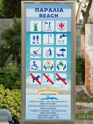
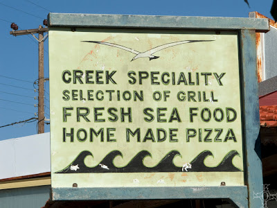
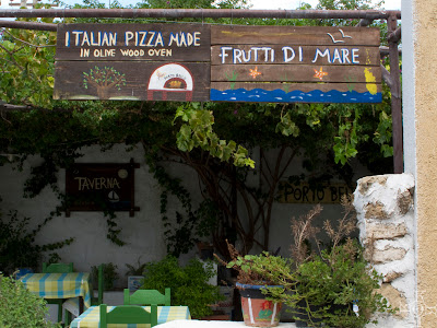
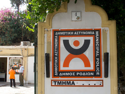
... from the spectacular Greek island. Typography, ancient pieces and other beauties.


More pics are here.

20100822

Hungarian Society in Aalborg

After a long and proper planning process and organizing the Hungarian Society in Aalborg is established. The first assembly was held on the 10 July where the members decided to start up a Hungarian weekend school and kindergarden for children who live in/around Aalborg and a lot of great ideas popped up: film club, book club, excursions, etc.
The virtual meeting point of the whole group is here - the webdesign is still under constuction but the content is up-to-date.
The logo design was my task where besides the name of the society in Hungarian (Aalborgi Magyarok Társasága) I wanted to express our aim by using the Danish and the Hungarian flag: we would like to make some positive changes in our life here, in Denmark by networking, fusion and organizing exciting common activities.


Our second meeting was an informal celebration of the 20 August which is a Hungarian national holiday, the day of our first king St. Stephen (Szt. István) who founded Hungary and the the day of the new bread. Here is the invitation:

20100725

Maritime inspiration

...from The Tall Ships Races 2010 in Aalborg. (More photos with less focus on the graphical details are here and here.)


20100629

Photos

After buying a new digital camera I decided to share my favorite pics in a public album here.
Some samples: